Ian is an Eclipse committer and EclipseSource Distinguished Engineer with a passion for developer productivity.
He leads the J2V8 project and has served on several …
When Eclipse 3.0 shipped in 2004 it brought a new look to the workbench. Now, 10 years later, an entirely new Dark Theme is launching. Eclipse Luna will ship in less than a week and to help mark the occasion, I’m counting down the Top 10 Eclipse Luna features that I’m really excited about.
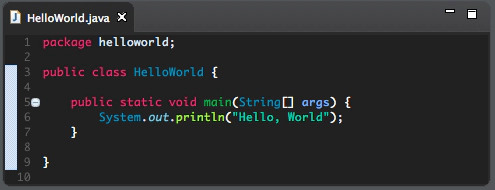
Number 5 on my list is the new Dark Theme. Developers are passionate about their tools, and many developers take great pride in customizing the look and feel of their development machines. With the dark theme, Eclipse now looks beautiful on development machines with other dark system settings enabled.
The theme extends to more than just the Widgets. Syntax highlighting has also been improved to take advantage of the new look.
 Eclipse Luna is also shipping with a new set of platform icons which look much better on both light and dark themes.
And of course the theme is cross-platform, supporting Mac, Linux and Windows.
In addition to the dark theme, the Eclipse logo has also changed, bringing a new Splash Screen, Icon, About Dialog and an entirely new look to the Eclipse.org website. Congratulations to everyone involved in all these efforts. Change is never easy, especially when it involves the appearance of developer tools – it seems suddenly everyone has an opinion.
To use the dark theme, go to Preferences -> General -> Appearance and choose ‘Dark’. For more Eclipse Tips & Tricks, follow me on Twitter.
Ian is an Eclipse committer and EclipseSource Distinguished Engineer with a passion for developer productivity.
He leads the J2V8 project and has served on several …