Jonas Helming, Maximilian Koegel and Philip Langer co-lead EclipseSource, specializing in consulting and engineering innovative, customized tools and IDEs, with a strong …
EMF Forms Rendering
8 min ReadEMF Forms is a component of the EMF Client Platform project that provides a form-based User Interface to display and edit your data, a.k.a. the entities of your application. The UI is rendered based on a view model at runtime and provides an out-of-the-box experience while being highly customizable. If you are not familiar with EMF Forms yet, please read this tutorial.
This blog post describes what is new with the EMF Forms 1.3.0 release in particular with regard to rendering. First we look at what rendering is and how it works.
Rendering Overview
A renderer is a piece of code that creates a UI at runtime with a specific widget toolkit, e.g. with SWT. The rendering process is abstractly depicted in Figure 1.
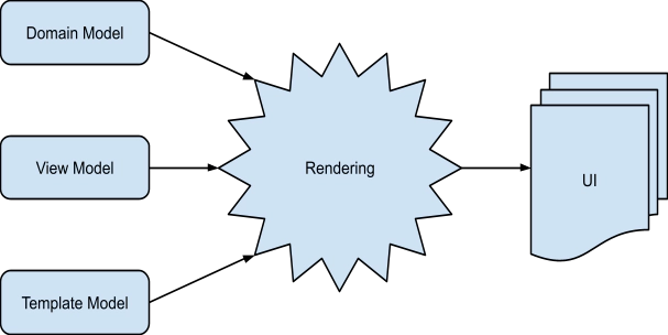 Figure 1
The renderer consumes three inputs: the domain model, the view model and the template model.
The domain model describes your data and is usually defined in an EMF Ecore file. The view model refers to the domain model to describe what is displayed in the UI but adds information on how it is displayed, e.g., in terms of a layout. Finally, the template model defines the style of the UI, e.g., font sizes and colors.
To describe this process more clearly, let us look at a step-by-step decomposition of the rendering process using a simple example.
The domain model will be the User from the MakeItHappen Model of the EMFForms Getting started turorial. It defines a User class with String attributes for firstName, lastName and email.
The view model is depicted below.

It contains three controls (text widgets) for displaying the controls firstName, lastName and email. It thereby defines that the three properties are to be displayed in one column, one below another in the given order.
Finally a template model could optionally define fonts for the text to be displayed.
Based on these three models, the renderer produces a UI that looks like this:

The decomposed process in this case would look like this:

The domain model and the view model are passed to the ECPSWTViewRenderer, which triggers the rendering. The first element of the provided view model is passed to the SWTRendererFactory. In the example case, the first element of the view model is the view. The SWTRendererFactory determines a fitting sub-renderer, which is the ViewSWTRenderer.
The ViewSWTRenderer has to determine which layout to use. This is done using the LayoutProviderHelper, which returns the necessary information on the actual layout of the whole composite. In the next step, all the child elements of the view have to be rendered by the ViewSWTRenderer. Thus, fitting renders have to be determined by the SWTRendererFactory. In this example, the fitting renderer for all three controls is the TextControlSWTRenderer.
The TextControlSWTRenderer renders the label of the control, the validation icon and the editable control itself. For this step, it relies on the VTViewTemplateProvider, which checks the TemplateModel in order to determine which style to use (e.g., font).
The last step is done by the ViewSWTRenderer, which applies the correct layout to the rendered controls using the LayoutProviderHelper.
In the following section, we will look at the ingredients of the process: the renderers for single view model elements, the styles in the template model and, finally, the layout provider helper.
⇒ Find out more about Developer Support and Training or contact us.
⇒ Further Documentation for EMF Forms
New Rendering Customizations
The rendering process that was described is based on the 1.3 release of EMF Forms. In the next sections, I will demonstrate three rendering customizations that are introduced with the 1.3 release. You can find a list of all changes done in 1.3 on eclipse.org.
Prioritized Renderer Tester
The first feature enhancement is the unification of the ECPControlFactory and the SWTRendererFactory. Before 1.3, there was a specific renderer for all VControls that delegated to the ECPControlFactory. The ECPControlFactory then rendered the control itself. In Version 1.3, the ECPControlFactory became obsolete and will be removed in future releases, as it is a duplication of the SWTRendererFactory.
The benefit of this unification is that there is no difference between registering new renderers for model elements and registering new controls. The SWTRendererFactory uses the ECPRendererTester for deciding which renderer to use. Since the 1.3 release, the ECPRendererTester now returns a priority instead of a boolean. This way, it is possible to replace an existing renderer by providing an ECPRendererTester with a higher priority instead of removing the “wrong” renderer from the run configuration. Furthermore, it is possible to replace a renderer only for specific features.
For example, the email control of the user should be replaced by a text control and a button that will trigger the default email application. For this, a renderer and a tester are needed. The tester looks like this:
public class EmailControlRendererTest implements ECPRendererTester {
  @Override
  public int isApplicable(VElement vElement,
                          ViewModelContext context) {
    if (!VControl.class.isInstance(vElement)) {
      return NOT_APPLICABLE;
    }
    EStructuralFeature feature = VControl.class.cast(vElement)
                                   .getDomainModelReference()
                                   .getEStructuralFeatureIterator()
                                   .next();
    if (feature.equals(TaskPackage.eINSTANCE.getUser_Email())) {
      return 10;
    }
    return NOT_APPLICABLE;
  }
}
In the tester, the method isApplicable must be implemented. It provides two parameters, the VElement that should be rendered and the ViewModelContext used during rendering. For the email tester, the provided VElement must be a VControl, otherwise the provided renderer won’t work. Next, the feature must be checked because it has to be the email feature of the user. For this check, the VDomainModelReference of the VControl is checked.
The renderer itself is quite straightforward, it just extends the existing TextControlSWTRenderer:
public class EmailControlRenderer extends TextControlSWTRenderer {
  @Override
  protected Control createSWTControl(Composite parent,
                                     final Setting setting) {
    final Composite main = new Composite(parent, SWT.NONE);
    GridLayoutFactory.fillDefaults().numColumns(2).applyTo(main);
    GridDataFactory.fillDefaults().grab(true, false)
      .align(SWT.FILL, SWT.BEGINNING).applyTo(main);
    Control control = super.createSWTControl(main, setting);
    Button button = new Button(main, SWT.PUSH);
    button.setText("Send Mail");
    button.addSelectionListener(new SelectionAdapter() {
      @Override
      public void widgetSelected(SelectionEvent e) {
        try {
          Desktop.getDesktop().mail(URI.create("mailto:"
            + getModelValue(setting).getValue()));
        } catch (IOException e1) {
          // ignore failure to open mailto
        }
      }
    });
    return control;
  }
}
To add the necessary button, the EmailControlRenderer extends the TextControlSWTRenderer and overrides the createSWTControl method. A new composite is created, and the existing text control is rendered onto the new composite. The email button is also added.
By adding a bundle containing those two classes, which are registered accordingly, the rendered UI looks like this:

Styles
Since release 1.2, EMF Forms contains a template model that allows you to set validation icons and colors.
The 1.3 release extends the template model and makes it more generic, as it now also contains styles. Styles are rendering properties that allow you to customize properties of UI elements. Styles are very popular in html as they allow you to influence properties like the background color, the alignment, etc. of elements.
The styles in EMF Forms are based on the idea of CSS. Thus each style has a selector and a list of properties. The selector has to implement an isApplicable method that defines how well a style fits. This is important if multiple styles provide the same property. Currently, only a domain model reference selector is available, which allows you to define a style for a specific attribute. As for all other model elements, you can always provide your own selectors.
A property is just a marker interface since styles can provide arbitrary information. At the moment, there are only two implementations, one is the ValidationProperty, which provides all the fields already used in the template model, and the other is the AlignmentProperty, which defines the text alignment of a text field.
So if you have your own model element, which you want to be able to customize just like you would using CSS, go ahead and implement your styles and selectors.
For example, the alignment of the email control will be changed from left-aligned to right-aligned.
In our example, a template model was already provided and the UI looked like this:
 |
After changing the style property to right:
|
⇒ Find out more about Developer Support and Training or contact us.
⇒ Further Documentation for EMF Forms
Layouts
With the EMF Forms 1.3 release, the layout provider is responsible for the layout of controls as well as for the layout of the containers. This way it is possible to customize the layout behavior of the renderer.
Using the default layout provider of EMFForms, all controls will grab as much space as possible and fill this space.
For this example, the controls should take only as much space as needed. For this a LayoutProvider is defined as follows:
public class CustomLayoutProvider extends AbstractLayoutProvider {
  @Override
  public Layout getColumnLayout(int numColumns, boolean equalWidth) {
    return GridLayoutFactory.fillDefaults().numColumns(numColumns)
                            .equalWidth(equalWidth).create();
  }
  @Override
  public Object getLayoutData(GridCell gridCell,
      GridDescription controlGridDescription,
      GridDescription currentRowGridDescription,
      GridDescription fullGridDescription,
      VElement vElement,
      Control control) {
    return getSpanningGridData(1, 1);
  }
  private GridData getSpanningGridData(int xSpan, int ySpan) {
    return GridDataFactory.fillDefaults()
                          .align(SWT.BEGINNING, SWT.BEGINNING)
        .grab(false, false)
                          .span(xSpan, ySpan).create();
  }
  @Override
  public Object getSpanningLayoutData(int spanX, int spanY) {
    return getSpanningGridData(spanX, spanY);
  }
}
The LayoutProvider must implement three methods. The getColumnLayout method is used for the layout of the container element. The getLayoutData method is used for the layout data of all elements that are rendered. The getSpanningLayoutData method is used for layouts that simply need to be spanned.
Here is a comparison between a UI with the default LayoutProvider and a UI with the custom LayoutProvider:
Default LayoutProvider:
Custom LayoutProvider:

Finally we added a lot of small improvements and bug fixes. Please see the news and noteworthy list on the EMF Forms Download site for details:
https://eclipse.org/ecp/emfforms/download.html
We hope you enjoy the new release and its features, and we are looking forward to your feedback!
⇒ Find out more about Developer Support and Training or contact us.
⇒ Further Documentation for EMF Forms