Tabris.js 2.0 – Top 10 Features: AlertDialog
With the Tabris.js 2 release only a few days away we continue our rundown of the Tabris.js 2 Top 10 features. Today we focus on the highly requested modal dialog. A modal dialog is used to show contextual information while blocking the rest of the UI. It is able to inform the user about important events or to request immediate feedback.
AlertDialog
With Tabris.js 2.0 we enable these types of scenarios with the new AlertDialog. The AlertDialog allows to configure a modal dialog with title, text and up to three buttons. The buttons have are given a type like “ok” or “cancel” to provide hints to the native platform where to position the button.
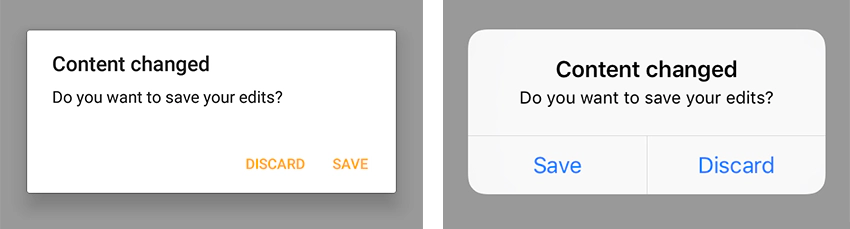
The screenshot above shows an AlertDialog with a title, text and two buttons. To create such a modal dialog we use the following code.
[js] new AlertDialog({ title: ‘Content changed’, message: ‘Do you want to save your edits?’, buttons: { ok: ‘Save’, cancel: ‘Discard’ } }).on({ closeOk: () => console.log(‘Save’), closeCancel: () => console.log(‘Discard’), }).open(); [/js]
An AlertDialog allows to attach specific listeners for the button types (eg. closeOk) or a generic close listener to intercept all events. You can find more examples for the AlertDialog in the AlertDialog snippet.
Tabris.js 2.0 - Top 10 Features
The AlertDialog is just one of the cool new additions to Tabris.js 2. Don’t forget to check out the other top 10 features in the rundown below.
