Tabris.js 2.0 Beta 1 is here
It’s a heated time for Tabris.js development as we are getting closer and closer the Tabris.js 2 release. Plenty changes relevant to UI, navigation and mobile app security have been introduced. Today we’re sharing some of them with you in the first official beta of Tabris.js 2.0.
Note: To use the beta, you need to download the new Developer App, Tabris.js 2.
[

New UI Model
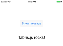
Pages used to be the main building blocks of a Tabris.js app, with all widgets appended to them. While they are still useful for organizing an app, pages are now optional. You can add your widgets directly to the main area of the app (the tabris.ui.contentView).
new tabris.Button({
  centerX: 0, top: 100,
  text: 'Show message'
}).appendTo(tabris.ui.contentView);
If you want to add widgets to the drawer, append them to tabris.ui.drawer. 
Find out more about the new UI model in Tabris.js UI docs.
New Page Navigation
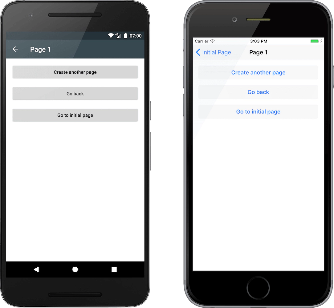
The new widget NavigationView is now responsible for page-based navigation. By creating multiple instances of this widget, it is possible to have multiple page stacks in an app, for example in different tabs.
Pages are appended to and removed from a NavigationView using the standard widget methods append(), appendTo(), detach(), and dispose(). When a page is added, it becomes the topmost page on the page stack and covers any previous page. When a page is removed from a NavigationView, all pages on top will be disposed automatically. (It is also possible to override this behavior.)
In addition to its main function of providing navigation, the NavigationView widget also allows you to style the Page header. It is highly configurable, e.g. you can enable/disable its components and set specific colors.
Customizable StatusBar and NavigationBar
We have added the object tabris.ui.statusBar to represent the system status bar widget. You can change the StatusBar to a color matching your app’s design or brand, or disable it completely to go full screen.
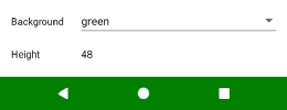
On Android, it is also possible to customize the NavigationBar. The object tabris.ui.navigationBar can be used to control its background color and visibility.
AlertDialog Support
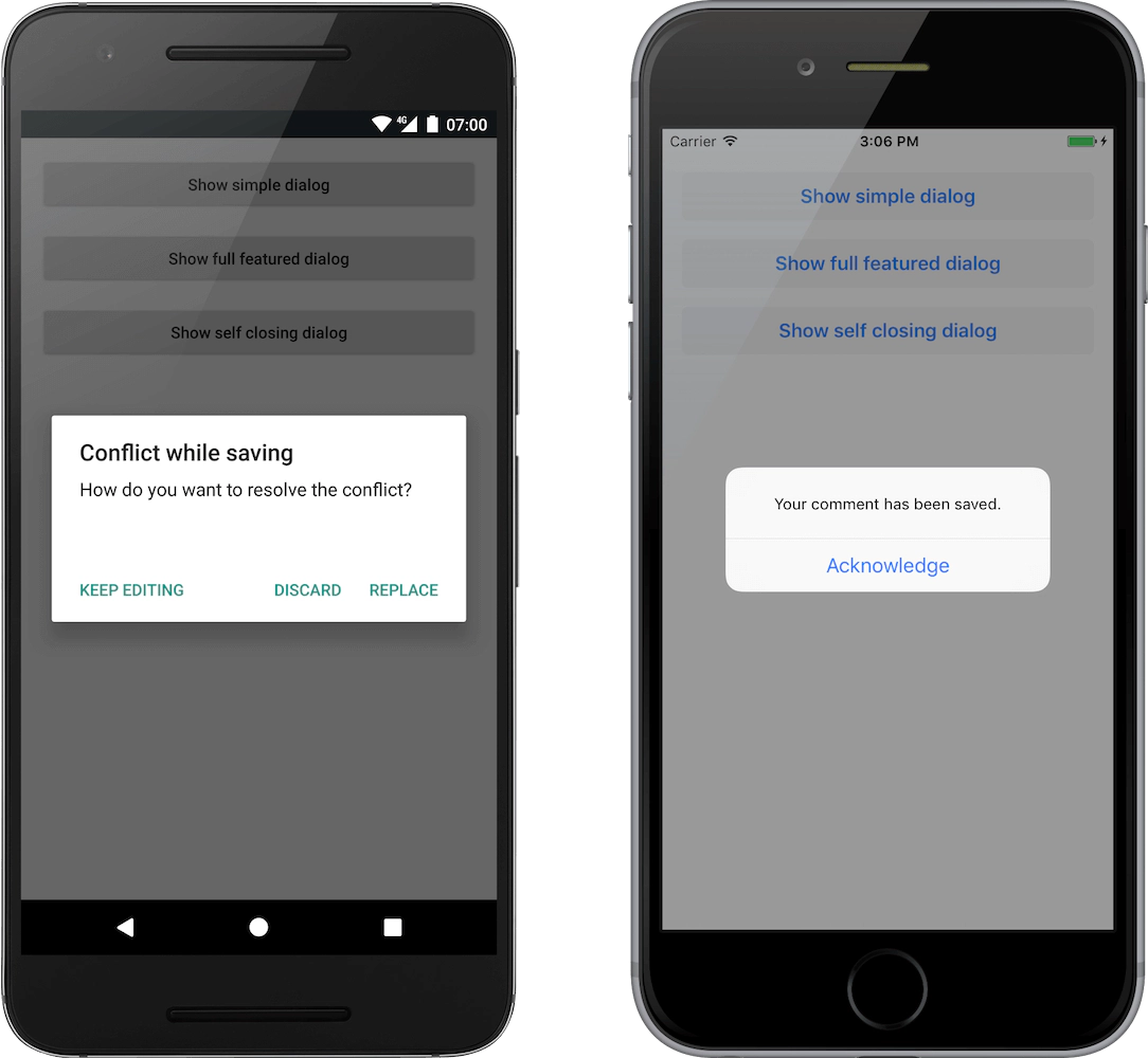
The new type AlertDialog allows you to display modal dialogs to the user. These type of alerts are used to get a user’s attention, usually when an interaction is needed. An alert dialog can contain a message text and up to three buttons with custom texts.
Enhanced Widget APIs
Several widgets have been revisited with enhanced APIs:
- The new property
keepFocushas been introduced on TextInput. When set to true, the TextInput will keep its focus, even when tapped outside of the widget bounds. - We have enabled finer grained control of scrolling in ScrollView using the
scrollToX()andscrollToY()methods (the old propertiesoffsetXandoffsetYare now read-only). tabModeon TabFolder can be used to set overflow behavior on Android. When set to ‘scrollable’, the tabs in the tab bar will overflow and can be scrolled.- The read-only properties
id,version, andversionCodeontabris.appprovide information on the app ID and version. - TextView on Android now supports the
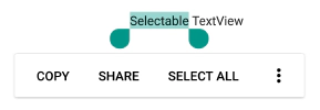
selectableproperty. You can use it to enable copying text from a TextView into the clipboard.
HTTP: Certificate Pinning and Binary Content
The new property pinnedCertificates on tabris.app can be used to enable certificate pinning. Certificate pinning provides an additional security layer for your Tabris.js app. When connecting to a dedicated, pre-configured server over an encrypted channel, you can use pinned keys to further confirm the server’s identity. While pinning a certificate, the following components match the certificate: XHR/fetch, WebSockets, image loading and app patching.
Tabris.js 2.0 Beta 1 also adds support for receiving binary data, e.g. when you need to load a raw image. The responseType ‘arraybuffer’ is now supported by the XHR implementation.
Developer Console Pinning (Android)
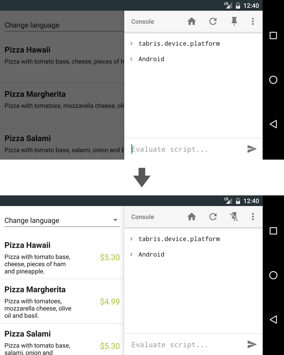
On Android it is now possible to pin the developer console to the side of your mobile device screen. With this nifty addition you can reveal the part of the app previously covered by the console and have easier access to your changes.
Tip: Try it in horizontal view to make the best use of the whole screen while you are testing your app.
Resource Drawables in Image Objects (Android)
Resource drawables have landed on Android. The use of the scheme “android-drawable” allows to load bundled Android drawable resources by name:
new tabris.ImageView({
  left: 16, top: 16, width: 250, height: 100,
  image: {'src': 'android-drawable://drawable_name'}
});
With this implementation, we benefit from the various uses of drawables like vector images, gradients, state lists (focused/disabled etc). For example, a vector drawable can be used to scale the image in the ImageView according to the scaleType while maintaining image sharpness.
To learn more about drawable resources, check out the Drawable Resources Android API guide.
Project Setup with Tabris CLI
Last but not least, with the 2.0 Beta 1 we introduce a Tabris CLI - the set of command line tools to make developing Tabris.js apps even easier. It will not only create the basic files for your project, but also prepare what is needed for the build process and set up ES6 or TypeScript support.
Answer some questions about your app, and Tabris CLI will take care of starting your project.
There are even more changes coming with Tabris.js 2.0 Beta 1. If you’d like to know more, have a look at the Tabris.js GitHub project release page. And if you are just starting out with Tabris.js, check out the Tabris.js ‘Getting Started’ ebook.
Happy coding!
