Styling a Tabris.js TabFolder for Android Material Design
January 29, 2016 | 2 min ReadUPDATE: The post has been updated to use the new tabris.TabFolder api
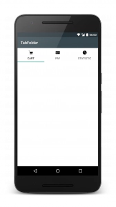
Creating a good mobile app goes hand in hand with creating a well designed mobile app. With Tabris.js you are able to cater the style of your app to your design needs. One of the more iconic widgets on Android is the tab. In Tabris.js tabs are represented by the TabFolder widget. The following code is taken from the Tabris.js snippets and shows a TabFolder in its default appearance:
var tabFolder = new tabris.TabFolder({
  left: 0, top: 0, right: 0, bottom: 0
}).appendTo(page);

var createTab = function(title, image) {
  new tabris.Tab({
    title: title,
    image: {src: image, scale: 2}
  }).appendTo(tabFolder);
};
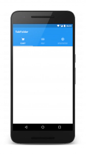
While the default style doesn’t look too bad, there is more we can do to bring the Android material design to life. The following snippet shows a few properties that can be set in order to give a consistent branding color and style to your app:
tabris.ui.set("background", "#2196F3");

var tabFolder = tabris.create("TabFolder", {
  left: 0, top: 0, right: 0, bottom: 0,
  background: "#2196F3",
  textColor: "white",
  elevation: 4
}).appendTo(page);

var createTab = function(title, image) {
  tabris.create("Tab", {
    title: title,
    image: {src: image, scale: 2},
    background: "white"
  }).appendTo(tabFolder);
};
The most notable change is the color of our app. To colorize the app we set the background color on the tabris.ui and the TabFolder to our brand color. Defining the background color on the TabFolder has the side effect that the content area of the tabs is also colorized. To counteract this effect we set the tab background to white.
With the main color in place we now set the textColor property of the TabFolder to a pleasant foreground color, in our case that is a white color.
The final touch is to create some more separation between the tab and the content area. To do so we change the elevation property on the TabFolder to 4. This lifts the tab area up on the z-axis and creates a separating shadow effect (Android 5+ only).
These are some of the tips that will help you to make your Tabris.js Android client shine. Also check out how to provide your own custom Android theme. :)
Keep in mind that these styling guidelines apply to Android and other measures should be taken on different platforms. Happy styling.

