Customizing the Appearance of a Tabris.js Android app
April 29, 2015 | 2 min ReadBuilding a Tabris.js client for Android or iOS has gotten pretty easy thanks to the Tabris.js build service. For the Android client you don’t even need to provide a signing certificate to get started: Simply hit “Build Android App” and off you go. Since the build infrastructure is based on the Cordova platform, you can use the build’s config.xml file to provide custom branding like icons or app name.
Tabris Android Themes
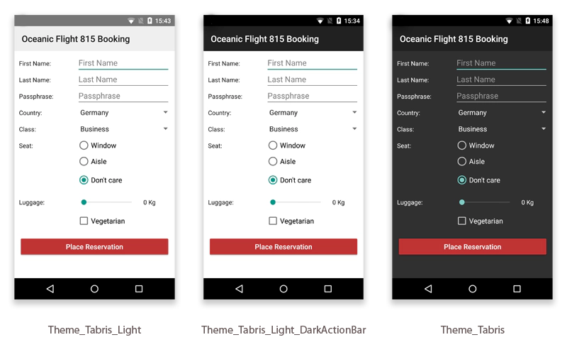
The config.xml also allows you to provide additional parameters specific to the Tabris.js Android client. In this blog post we will focus on the Theme parameter that allows you to define the Android theme for your app. By default Tabris.js ships with three default themes:
com.eclipsesource.tabris.android.R.style.Theme_Tabriscom.eclipsesource.tabris.android.R.style.Theme_Tabris_Lightcom.eclipsesource.tabris.android.R.style.Theme_Tabris_Light_DarkActionBar
When you don’t specify the Theme attribute, Tabris.js uses the Theme_Tabris_Light_DarkActionBar by default. To apply a theme use the the following snippet in your config.xml:
Under the hood these three themes map to an Android version specific theme. On Android 4.x the Holo theme counterparts are used whereas on Android 5.x a material design theme is used. The screenshots below show the same app build with the three different themes on Android 5.x:
Outlook
In the next part of this series we will learn how we can customize our app by extending one of the base themes. Stay tuned. :)
