Layouting in Tabris.js
Warning! This article is outdated and might not represent the current state of Tabris.js.
One goal most app developers pursue is to create a sexy and silky-smooth UI with an interface that adapts to different screen sizes and device types. This goal has mostly been reserved for native developers on mobile platforms.
With Tabris.js, you get to use all-native widgets but with much simpler code and without the need to know the specifics of the target platform.
In Tabris.js the “application logic” runs in a JavaScript VM. The code is not cross-compiled or executed in a browser - instead it is executed in a JavaScript VM. The VM runs on a separate thread, embedded in your app.
In your code you create UI objects with properties, relationships and layout information. Those objects are like proxy objects. The “real” UI objects live in the native world as iOS widgets (UIView, UICollectionView, UIButton…).
As you can see, you usually provide an abstract layout description with offsets and relations. Possible properties are: left, right, top, bottom, width, height, centerX, centerY and baseline. Possible values for most properties are: offset, percentage with an offset or a reference to a sibling with an offset. The execution and calculation is done on the native side using the corresponding state-of-the-art layout techniques. On iOS we use Auto Layout.
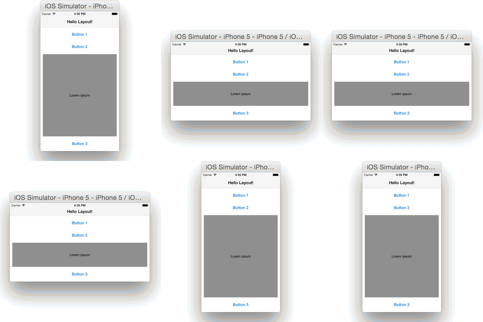
This is the result:
There is a neat little detail: nowhere in the layout is a height defined. The buttons will compute their height according to their intrinsic size. The TextView in the middle will adapt to the available space between the buttons.
I think the layout code of this UI looks quite readable but concise. You can understand how the widgets are arranged, without running into a buffer overflow in your in-brain-interpreter. ;)
But where there is light, there must be shadow. The ease of use can come with a price: Complex UI constructs (not the one above, of course) can take a moment to layout. The more information is left out in your code, the more must be computed during layout. (See the in-depth analysis of Auto Layout Performance on iOS by Florian Kugler.)
So, as an option to improve the performance you have the same means at hand as a native (Objective-C/Swift, Cocoa Touch) developer. You would then directly set the bounds (aka frame) of your widget. In Tabris.js this can be done by using exactly four properties in the layout data: left, top, width and height. By using these properties as layout data, the information can be directly used to position the widget with absolute coordinates in the UI, without the need to create constraints or involve any other layout-related computation.
This doesn’t mean you need to do that often - and please remember: “Premature optimization is the root of all evil” and leads to complicated code. But you may get to a point where the most sophisticated native and hardware accelerated algorithms are not fast enough - then it’s good to know of this possibility.
What’s important is that you have a choice!
Disclamer:
I’m talking for the iOS side of Tabris.js here. But be assured, the Android implementation is in no way inferior or less sophisticated, and it’s perfectly capable of achieving the maximum fps possible on the platform: the magic 60fps.