RAP 3.0 M3: revised ScrollBar, row templates in Nebula Grid
November 17, 2014 | 3 min ReadLast Friday, 14 November 2014, we published another milestone build for RAP: RAP 3.0 M3. It is available for download from https://www.eclipse.dev/rap/downloads/. This milestone is mostly about theming improvements.
What’s included?
Modernized ScrollBars
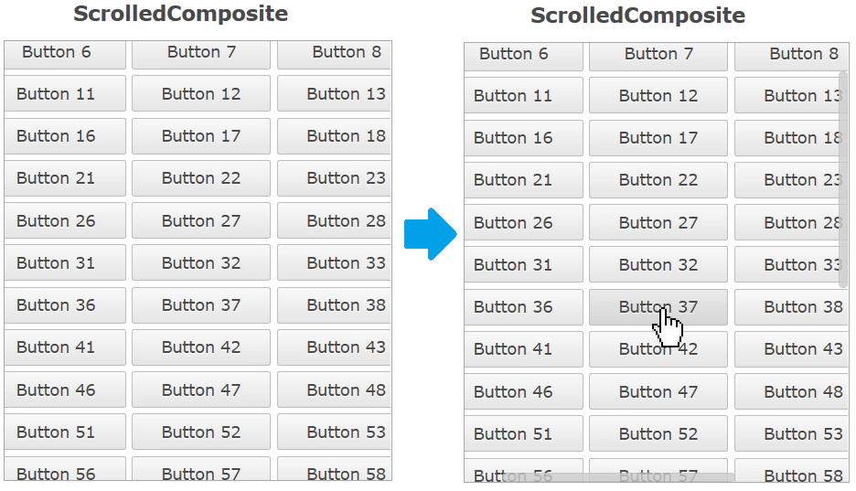
In the default theme, ScrollBars now have a more modern look and feel. They are invisible until they are “activated” by the user, which is when the indicators fade-in to a semi-transparent state.
This is achieved with a number of new theming options. The opacity property lets you make the entire ScrollBar (semi) transparent, with the content below visible. In addition, the new active state is used to indicate that the scrollable area is hovered with the mouse, or that the user is scrolling using the keyboard. Already added in M2 was the feature that the up/down (or left/right) buttons disappear if no image is set for them.
If you don’t like the new look and feel, don’t worry. The business theme makes no changes to the ScrollBars, and by making a theme contribution you can easily adjust the opacity for the active and non-active states to different values (e.g. “1” for both) and/or change the ScrollBar background from “transparent” back to a solid color.
Row Template for Nebula Grid
Row Templates now also work with the Nebula Grid:
Row Templates allow you to customize the way a Table or Tree present Items on screen, completely replacing the default column layout. A template consists of text and image cells that can be freely arranged.
***
As usual, we fixed a few bugs - this list shows bugs that have been fixed for this milestone build.
Other recent features
M3 builds upon some of the theming improvements added in the previous milestone. In case you missed them, here’s a summary of theming features that were part of M2:
Different borders for different edges
Until now every edge of a widget in RAP had to have the same border width, style and color. Now every widget that supports the border shorthand property also supports the four properties border-left, border-right, border-bottom and border-top. This enables a number of new design choices, like visually merging neighbouring widgets.
Hidden ScrollBar Buttons
The up/down and left/right buttons of scroll bars can now be hidden by setting the background-image property of ScrollBar-UpButton and ScrollBar-DownButton to none. This is the case in the default theme.
Hidden Focus Frame
The focus frame (represented in the theming by Button-FocusIndicator, Combo-FocusIndicator and FileUpload-FocusIndicator) will no longer be visible if the widget is focused by the mouse. Like in MS Windows, it will only be visible when focused using the keyboard.
TabItem theming enhancements
The TabItem has several new theming properties: border, color, background-position, background-repeat and margin. There is also a new state bottom on TabItem that the item is a child of TabFolder with the SWT.BOTTOM style flag.
New “even” state on Combo Items
The Combo-List now has an even state, allowing the Combo drop-down to have alternating background colors.
Stay tuned and follow us on Twitter to get all news and Trips & Tricks for Eclipse RAP.

