Firefox OS Peak - First Impressions (Part 1)
May 6, 2013 | 3 min Read On April 23rd, the Firefox OS developer preview phones became available in Europe - and were sold out in a few hours. The demand was so overwhelming that the supplier geeksphone had to shut down their online shop completely for a week. Now they are back online and have been busy delivering the phones - our’s arrived on Friday.
I will share my experience with the phone in a couple of blog entries, from first impressions to user experience topics, to trying Eclipse RAP and various mobile frameworks on the peak phone. Obviously I am also interested if Firefox OS should be a target for our Tabris framework. However, that will have to wait, lets get started with the first impressions:
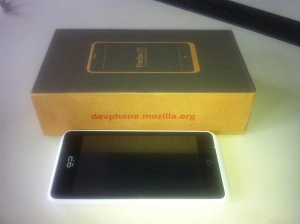
Packaging The packaging is made of recycled cardboard - good. Geeks care about the environment.
Contents Phone, earphones (including microphone), USB-cable and USB-charger. For my taste they could have saved both the earphones and the charger, or do you know any developers that don’t have at least a couple of these items anyway?
The Phone: Peak Case Makes a good impression at first sight, although it does not look “expensive”. The haptic perception is slick, with a tendency to slippery. I find it annoying that the back of the phone is uneven - the camera lens sticks out on one side of the upper half of the case. This makes it hard to type when you lay down the phone on its back, not really ideal for a development phone.
Display The display is ok, but the viewing angle is very narrow and the reflexions can be quite disturbing. Good that geeks love dimmed rooms …
Firefox OS Unlocking and browsing the main screens is easy, swiping between multiple panes with Apps is the established standard that Firefox OS is sticking to. Setting up accounts for mail and calendar worked well (Google Apps), only data entry is annoying. The on-screen keyboard is far from the responsiveness I am used to from my iOS / Android devices. Because the keyboard did not accept some of my strokes I had to try and put the cursor at a specific position in the text field, which is really a pain. Especially if the text is longer than the space available it is almost impossible to get to the position at the end of the entry. Not that I am very fond of the iOS magnifying glass or Android Cursor / Range Selection mechanism, but this is close to completely unusable.
When testing the mobile browser I almost gave up on entering a somewhat longer URL. Beside the problems described above, the browser started to load the URL while I was still typing, so I had to go and try to add something at the end of the URL multiple times. Calendar and Mail that are coming with Firefox OS show that there is potential for a browser-based operating system, but Palm OS has been there as well, with even sleeker apps and did not quite make it.
I am going to use the phone over the next couple of days - I will write about the browser in the next post as it is at the core of the entire system.