RAP 1.5: the Workbench and the New Default Theme
August 16, 2012 | 3 min ReadLast month I wrote a post on the new look and feel of e4 and helped all those to revert to the old style that did not like the new theme: Eclipse 4 Theme - ‘New’ vs ‘Classic’. This time I am writing to help developers move back to the old classic theme of RAP.
Developers who run their exiting RAP applications on the new Version 1.5 of RAP that was released with the Eclipse Juno Simultaneous Release, were probably just as surprised by the UI changes as the users that had a first look at e4!
RAP now ships with a new default theme. So any application that does not specify the theme to use, now looks differently on the new runtime - see RAP 1.5 - New and Noteworthy for more details. In this case I actually much prefer the new style. RAP widgets no longer look like the plain SWT-widgets they originally tried to copy, but rather use the Html style features that make modern widget-toolkits look good.
So why would I want to help developers to move away from this major improvement?
There are situations where the new theme does not make you application look better! The main reason that I can think of, is that the new theme is wasting much more space. The better looks are often achieved with borders and padding that make the widgets take more space. Especially the Workbench does not look right with the new theme.
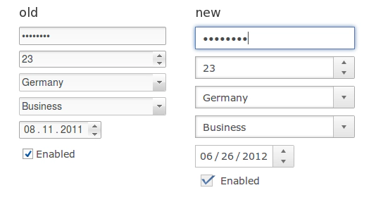
On the screenshot (taken from the release notes) you can see how the new widgets looks much more refined and professional, but also how it takes up more space:

Here is the trick:
* The classic theme has the id: ‘org.eclipse.rap.design.example.business.theme’ and is part of the ‘org.eclipse.rap.design.example.business.theme’ bundle that ships with RAP 1.5.
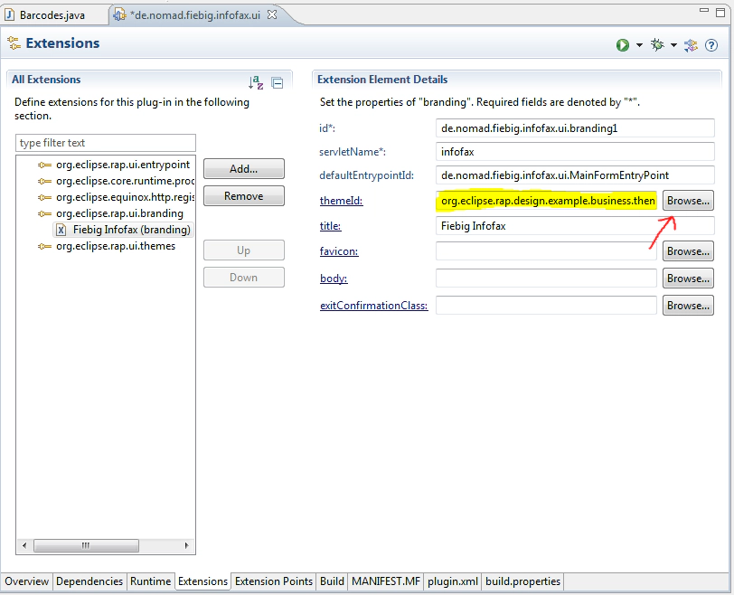
* If you already have a branding specified for you entry point, then just edit the corresponding theme id.
* Else, you need to create a ‘org.eclipse.rap.ui.branding’ extension. This is something I recommend anyway, since it maps your entrypoint to a servlet (and thus eliminates the ‘startup=xyz’ parameter in the URL) and adds other nice little features that make you app look more complete (favicon, title …).
* Make sure that the ‘org.eclipse.rap.design.example.business.theme’ bundle is part of your launch configuration (and of your deployment) and test your application with the newly specified servlet.
Here is a screenshot, of how a branding should look like:
Please also note that you can register many branding extensions even for the same entrypoint, to have the same application run with different themes on the same instance/installation :-).
You might ask yourself why the new default theme has not been designed with the Workbench in mind! Is the RAP-Team no longer interested in the ‘RCP Single-Sourcing’ community? It Definitively still is! But with Version 1.5 RAP has also become an attractive alternative for non SWT-based web development! To achieve this, the focus of the widget toolkit had to shift away from the SWT look and feel.
Enjoy the new and the classic RAP themes ;-)
