Eclipse 4 Theme - 'New' vs 'Classic'
July 6, 2012 | 2 min ReadA few days ago, my colleague Ian ended his excellent and famous Top 10 Eclipse Juno Features List with his #1: the Eclipse 4.x Platform.
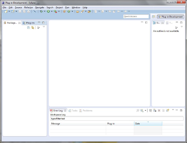
As Ian mentionend, Eclipse 4 brings a whole new look to the workbench. As a reminder, here is a screenshot of Eclipse 4 as it is being shipped (on a Win7 machine):
Yes, the workbench has a new look and feel. And although I am excited about the changes under the hood, like the EMF based programming Model and the CSS Styling of widgets with the very handy css-spy (to only name a few), I am not so comfortable yet with the new Eclipse 4 look. Call me old fashioned! Maybe in a few weeks, once I learned to appreciate the new theme I might feel differently about it, but for now, I want the cosy feeling of my good old 3.x Eclipse :-).
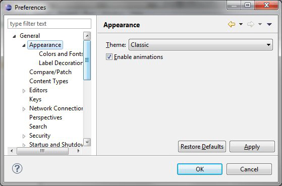
Here is the solution: Of course, the very flexible, powerful and extremely extensible Eclipse framework has a setting (and actually always had) to change the look and feel. As you can see in the following screenshot, in the preferences under ‘General/Appearance’ you can choose the ‘classic’ theme:
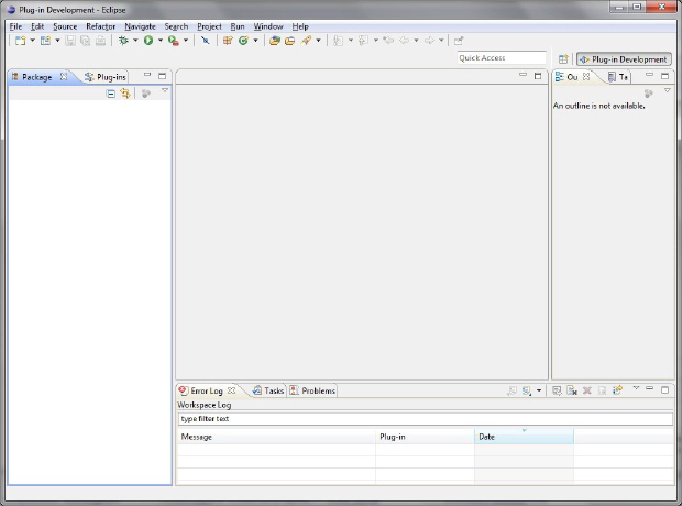
Et voilà! Here is Eclipse 4 in its old but familiar dress [EDIT: after a restart :-)]:
I wonder if I am alone with this feeling/taste - how do others feel about the Eclipse 4 look?


