Jonas Helming, Maximilian Koegel and Philip Langer co-lead EclipseSource. They work as consultants and software engineers for building web-based and desktop-based tools. …
EMF Forms - View Model Elements
13 min ReadThis tutorial provides an overview of all available elements of the view model. Please refer to this tutorial for a general introduction into EMF Forms and View Modeling.
View
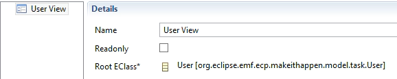
Views are the root element of every view model. If you create a new view model using the IDE Tooling, the root view will be created by default. The name of a view is only used for better identification within a view model; it is not rendered. A view specifies the root EClass of the domain model shown in the UI. This attribute (Root EClass) should be set as a first step when creating a view model. Please note, that this is already done for you, if you create the view model using the EMF Forms tooling. If you want to set the Root Eclass manually, double click a view and select the link button right to the “Root EClass” attribute. The dialog allows you to select any EClass from all registered EMF models. If you want to create a view showing a hierarchy of objects, select the root class of this tree.
After linking a view to an EClass, you can continue to customize the view by adding children to it (right click on the view to add children). Some child objects will access the root EClass, e.g., a control will allow you to bind to attributes of the EClass. Therefore, you should set the root EClass first.
Control
Controls represent specific attributes or references of the domain model. In EMF, the common term for attributes and references is “feature”. By adding a control to the view model, you specify that a certain feature shall be visible and editable in the UI. It therefore specifies a binding between UI widgets and domain model features.
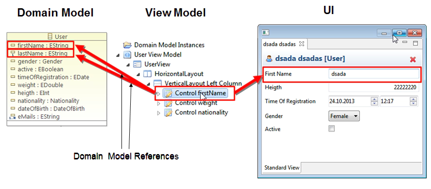
Controls can be added as children of any container, e.g., to a view on the root level or to layout elements. You can assign a name to a control for a better understanding of the meaning of the control. This name will, however, not affect the resulting UI. The label of a control will be retrieved from the domain model and can be adapted in the gen model.
The best way to create controls is to right click on the container you want to create a control in and select “Generate Controls”. On the first page, you select the EClass containing the feature you want to add controls for. If the EClass of the view has contained children, the dialog also allows you to bind to features of these child elements. The second page allows you to select which attributes and references you want to generate a control for. After creating controls, you can use drag and drop to move generated controls to other places in the layout.
Every control needs to specify which feature it is bound to. By default, this is exactly one feature. Please note that if you generate controls, the binding is already added so there is nothing to do.
Vertical/Horizontal Layout
Vertical and Horizontal Layouts are very simple, but powerful, container elements. Both can contain any other type of view model element, e.g., a control or another container. A horizontal layout arranges all children next to each other, a vertical layout arranges all children below each other. By nesting both layouts, or even by nesting other layouts, one can produce more sophisticated layouts that are still easy to understand. For better usability, you should assign names to the layouts, e.g., “root container” or “first column”. This will make it easier for a developer to understand an existing view model. However, these names will not be visible in the rendered UI.

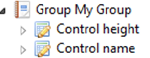
Group
This element allows you to group an arbitrary number of other elements, controls or containers. The default renderer draws a border around the children elements and displays them in a vertical layout.
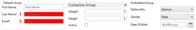
The standard renderer supports three different types of groups, which can be selected by the property “Group Type”
- Normal: Draws a border around the contained elements
- Collapsible: Allows you to collapse the contents of a group
- Embedded: Embeds the contents of the group into the parent layout but adds a title label
However, the concept of a group is very generic; it does not imply that a group is actually rendered as a bordered area. For example, an alternative renderer provided by EMF Forms uses an expand bar to render a group. Depending on the context of the UI, a group could also be a tab, a page or a dialog. Therefore, the use of elements such as Group offers a lot of flexibility for the resulting UI and allows you to reuse a view model in various use cases. It is therefore preferable to elements such as Vertical Layout, which are less flexible.

TableControl
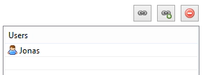
A TableControl displays child elements of an entity in a table. By default, EMF Forms will display a containment reference in a table but will only show the name of contained elements:
This list allows you to navigate to the children elements, which will open in another view. However, you might want to display the children of an element and their attributes within the same view in a table, allowing the user to directly see and edit them. This feature is provided by the TableControl. The following example is based on the “Make it Happen!” example model; please see here for more information. In the example, we will add a table control to the entity UserGroup showing the list of users in a table and allowing you to edit the attributes “first name” and “last name”. The relevant reference is “users”. In preparation, please make sure that the property type of this reference is set to editable in the Gen Model. By default, the property type of containment references is set to none.

A TableControl can be added just like a standard control anywhere within the view model. In the following example, we first define a view for a UserGroup (right click the task.ecore => EMF Forms => Create View Model). Within this view, we add a TableControl. The TableControl needs a DomainModelReference to determine which reference it will display. For TableControls, there is a special type: TableDomainModelReference.
However, the tooling will automatically create this for you. Click on the add button next to “Domain Model Renerence” in the detail pane of the table:
By default, select “FeaturePathDomainModelReference”:

Choose the reference, where input objects of the table should be retrieved from. In our example, these input objects are the users contained in a UserGroup:

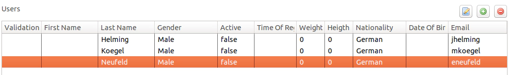
If you look at the preview, the table will now show all availabel attributes of User as a column:
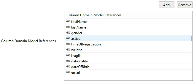
Showing all columns is the default, but you can specify the columns you want to show. columns of the table. Columns are added as sub-DomainModelReferences to the TableDomainModelReference. They specify the attributes of the referenced entity, which in our case is User, to be shown in the table. Without specifying any columns, the EMF Forms runtime will generated DomainModelReferences for all attributes by default.The best way to create columns is to right click on the table control and select “Generate Columns”. This will create a column for every attribute of the referenced class (in this example User) and since version 1.17.0 also all attributes of super classes. You can remove unwanted columns in the property view of the table control afterwards.
Sometimes it is inconvenient to edit an object directly in table row, i.e. because the information that needs to be entered is split over multiple columns which are not logically grouped. Also, depending on the available screen resolution (which might result in a scroll bar being displayed) and the number of attributes of the object in question, it might be difficult to find a specific column.
In such cases it is better to limit the columns displayed in the table to an essential set (i.e. columns needed to identify the object, for example its name and description) and enable detail editing instead.
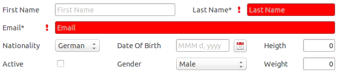
EMF Forms currently supports two forms of detail editing in TableControls. The first option is using a dialog, which the user can open by double-clicking on the row to be edited. The second option is using a detail panel. Use the option “Detailed Editing” of the TableControl as follow:
- None: In-place editing in the table
- WithDialog: A button opens a dialog that allows you to edit a table entry
- With Panel: A detailed area underneath the table shows the properties of the currently selected element and allows you to edit it
Please note, that the detailed pane and dialogs are also rendered with EMF Forms. So, you can specify the layouts and attributes, which are shown in a separate view model for this type (in our example “User”). Please note, that the View Model for the detail pane must be registered via the default extension point.
- .Finally, the attribute “Add Remove Disabled” of the TableControl determines whether the buttons to create and delete elements in the table are rendered or not.
The default table renderer is based on the SWT table. Please note, that there is an alternative table renderer based on Nebula Grid, which provides much more features, e.g. single cell selection. See here for details.
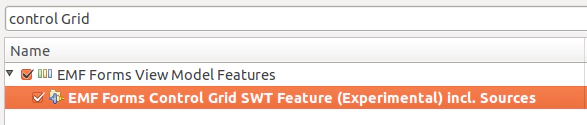
Control Grid
Typically, you do not have to deal with grid layouts, when using EMF Forms, as the rendering component automatically translates the layout information into the underlying UI toolkit. However, especially, when layouting controls, horizontal and vertical layouts are sometimes not enough, as you might want to create a section, where controls are in space-saving way. For this purpose, EMF Forms (since 1.9.0) supports an element called “Control Grid”.
It is a simplified version of a classic grid layout. The goal is to provide as much configuration options as needed, but still remain as simple as possible.
The Control Grid is explicitly focussed on layouting controls, and provides two additional layout containers: Row and Cell. Using those elements, you can specify the layout of controls more fine-grained, row by row, but still much simpler, than manually programming a grid.
After adding a control grid, you can add rows as children elements to it. In every row, you can then add an arbitrary number of cells to every row. Finally, you can add a control to every cell

Please note that the ControlGrid is currently not part of the regular SDK, you need to explicitly add this feature to your IDE to enhance the tooling, as well as to your runtime/product, to include the renderer. The feature can be found on the regular update site:
Tree Master Detail
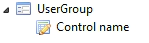
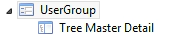
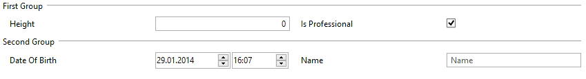
A Tree Master Detail view displays the hierarchy of a model instance in a tree. The left side shows a tree of all children of the root element. The tree allows to add new children elements (right click the parent), to delete elements and to modify the hierarchy using drag and drop. The right side show the detail forms for elements, which are selected in the tree. To use a tree master detail, create a view model for the root element (e.g. user group). Please note, that a Tree Master Detail makes only sense for elements, which can have children, so they should have containment references to other elements. If you just want to display the Tree Master Detail (typical use case), just add an Tree Master Detail element to the root of the view model. That is already all you need to specify, for the forms of the right site of the Tree Master Detail, EMF Forms will pick up the view models of the selected elements, so you can add independent view models for all elements in the tree. The root element of the tree is a special case, cause you have just already registered a view model for it, the one with the Tree Master Detail in it. If you now would select the root element in the tree, EMF Forms would render another Tree Master Detail on the right site recursively. For this reason, you need to register a second view model for the root element type. This one is then used for the right site of the Tree Master Detail, so it typically shows a form based UIs consisting of controls. To be able to differentiate between the two view models, you need to mark the one to be used within the Tree Master detail with the key “detail” along with its registration. The following example plugin.xml shows the registration of two view models for the type “User Group”. The first one will be used within a Tree Master Detail,
the second one contains the Tree Master Detail.
<plugin>
   <extension
         point="org.eclipse.emf.ecp.view.model.provider.xmi.file">
  <file filePath="viewmodels/UserGroup_Detail.view">
       <filter key="detail" value="true">
       </filter>
  </file>
  <file filePath="viewmodels/UserGroup.view"/>
     <file filePath="viewmodels/User.view">
      </file>
   </extension>
</plugin>
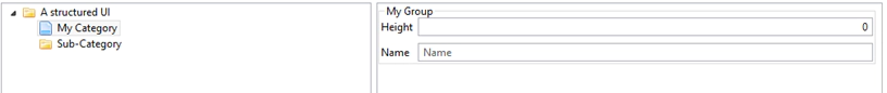
This will be the rendered result:

Please note, that a TreeMasterDetail is often used as the top element of an UI and therefore requires extensive customization and direct programmatic access to the TreeViewer. If you have such as use case, you can also “manually” render the EMF Forms TreeMasterDetail like this:
TreeViewerSWTFactory.createTreeViewer(parent, rootEObject)
This will create the same tree, but allowing you full access to the TreeViewer. See here for more details.
View Proxies
View Proxies allow the embedding of other view elements inside a view, facilitating artifact reusal. As an example, if your domain model specifies several classes inheriting from one super class, you can have one view model for the attributes of the super class and embedd this then into the view models of the subclasses.
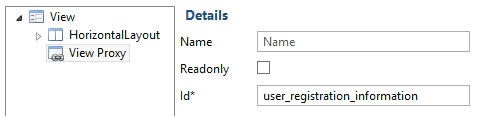
View Proxy elements can be added inside any container of the view and will act as placeholders for the views they reference, which will be resolved at runtime. The resolution is done using an id that the proxy must declare.
The same Id must be used by the view which is to be embedded, at registration, by declaring a filter with the “proxyId” key. An example registration is given below:
<plugin>
<extension point="org.eclipse.emf.ecp.view.model.provider.xmi.file">
<file filePath="viewmodels/UserRegistrationInformation.view">
<filter
key="proxyId"
value="user_registration_information">
</filter>
</file>
</extension>
</plugin>
The value of the “proxyId” key must be identical to the Id declared in the view that uses the proxy.
Based on this key, the View Proxy will be replaced at runtime with the original view object. The default case for View Proxy is to reuse view model for a common base class. However, you can write custom code to process view proxies differently in your projects, for example to replace view proxies with a certain id with a certain set of view model elements.
As a template on how to resolve proxies, have a look at the default implementations working with super classes, which can be found in this class.
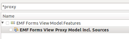
Please note that the ViewProxy Model is currently not part of the regular SDK, you need to explicitly add this feature to your IDE to enhance the tooling, as well as to your runtime/product. The feature can be found on the regular update site:
Additional Elements
EMF Forms provides even more view model elements such as:
Grouped Grid
Hierarchical Forms
Tree Master Detail Views

Rule-based enablement and visibility of parts of the UI
Hide or disable parts of the UI based on defined rules.
Label and Separators
Add static UI elements to structure the UI
… and many more
Finally, EMF Forms can easily be extended by new elements and concepts that fit your specific requirements. Professional support and training is available for this. Please contact us if you want to learn more about training and ways to customize and enhance EMF Forms.