Why is that button gray?
There is a user interface design issue that has been bugging me for quite some time, but I haven’t been able to put my finger on it until recently. How do you best represent disabled interaction elements (most often in the form of grayed out buttons and menu entries)? The visual cue here is that the action is not available at the moment. While that information is quite convenient, it raises the obvious question of:
Why is that action not available?
Often the answer might be obvious to the experienced user but this isn’t good for novices.
What about new or inexperienced users? Can’t we ease the learning curve a little and help users get to grips with the desired functionality? This might help avoid statements like…
“Oh wow, so that’s what that button does. I never used it because it was always disabled.”
In many cases there might only be a single reason why the action is unavailable. That means if the button is gray it is fairly simple to figure out what is amiss. But in non-trivial applications there may be a whole host of reasons why an action can not be performed. Typical reasons include:
- technical reasons: e.g. a “delete” action can not be performed if nothing is selected
- infrastructure reasons: e.g. a required service is unavailable
- operational reasons: e.g. user has insufficient privileges, or the action can only be performed during business hours
- business domain reasons: e.g. certain preconditions have not been met, or the action is incompatible with another action that has already been performed
That last reason can really be a big can of worms… because at least in my experience “businessy” applications have a propensity for growing complex rule sets that have to be modeled in software. That may even leave domain experts guessing why the button “re-evaluate taco consumption rates” is grayed out.
So is there way to deal with that problem in a more sophisticated and helpful manner?
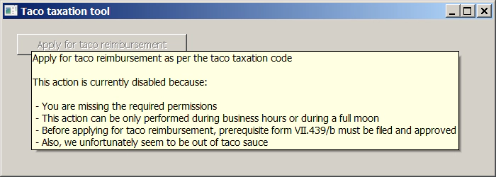
Here is an idea how the information could be presented in a natural and obvious way.

Tooltip for disabled elements - Answering the question
We’re doing nothing mind-boggling here but it gets the message across. On the implementation side of things, I could imagine something analogous to JFace style validators to attach to the button so that the appropriate message can be created on the fly. This might make for a cleaner technical design because different concerns of when to disable the button can be decoupled. One big drawback of this approach is that disabled (Windows) buttons don’t seem to show their tool tips. It may be possible to work around this problem with some SWT-fu though.
A more radical approach to the whole dilemma is the standpoint that disabled user interface elements are design smells that should be avoided completely. Applications should be designed in a way to support the necessary work flows and guide the user along logical steps… instead of doing trial and error and guesswork.
After all, trial and error and guesswork should be a domain reserved for point-and-click adventures.
So have you run into this issue as well? What were your experiences or solutions?